In life we often face the challenge of choosing the right colors. This happens when we need to choose clothes suitable for each other, shoes suitable for clothes, choose different wallpapers for the children's room, makeup, choose colors for our site and much more. The process of selecting several colors that combine with each other is called the construction of a color palette (gamut).
In colouristics there are several methods for constructing a color palette (color gamma) based on the arrangement of colors relative to each other in the color circle and, usually, having the same brightness. Harmonious perception of which is not sufficiently substantiated from the physical point of view.
The wave method of building color palette based on the relationship of color and acoustic waves, and also the concept of consonance (harmony) in music theory. Below is a more detailed description of the method.
This site allows you to choose the most harmonious combination of colors for your site, clothing, interior, etc.
The corresponding article was published on the site arxiv.org — https://arxiv.org/abs/1709.04752. Results are available on our site — wavepalette.com.
The wave method of building color palette
In music theory there is the concept of consonant intervals. Consonances are called intervals, sounding more softly and harmoniously. There are three groups of consonances: very perfect (perfect unison, octave), perfect (perfect quint, perfect quartet) and imperfect (big third, small third, sixth). There is also the concept of a consonant chord — a major or minor triad which consists only consonant intervals.
Acoustically, the essence of the difference between consonance and dissonance is expressed in different lengths of periods of regularly repeated groups of oscillations. The criterion of the difference between consonance and dissonance is the simplicity or complexity of the relationship: simpler relationship is more consonant, more difficult is more dissonant. Numerical proportions can be expressed in two ways: through the ratios of the lengths of the strings or through the ratios of the vibration numbers. In other words, the degree of consonance of two notes is determined by the number of coincidences of the periods of the corresponding harmonic functions of the dependence of sound pressure on time per unit time.

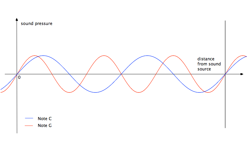
Figure 1: Graph of sound pressure versus time in fixed distance from sound source.
For example, notes C and G (perfect fifth) have the lengths of sound waves differing by 1.5 times. The graphs of the functions of the dependence of the sound pressure of the notes on time intersect on the abscissa axis (sound pressure equal to zero) when the sound pressure function of the note C makes two oscillations, and the function of the note G is three (fig. 1). On figure 1 this moment is marked with a vertical line.

Figure 2: Graph of sound pressure versus distance from sound source in fixed time.
If we imagine the propagation of sound pressure in space at a fixed time (near the sound source), then we get the same figure (fig. 2).
The notes С and E (the big third) have lengths of sound waves differing by 5/4 times. Their graphs intersect on the abscissa axis when the sound pressure function of the note C makes 4 vibrations, and the E note function — 5. That is why the perfect fifth is more consonant than the big third.
Color, like sound, is also a wave (wave-particle duality). In the case of constructing a consonant interval for a color, we are not limited by a small set of notes, but are limited by the wavelength limits of the visible light, just as the sound is limited by the wavelength limits of the audible sound.
Consider building of color palette for spectral and non-spectral colors.
Spectral colors
The spectral color is a color having a certain wavelength. To build a color palette, let's take, first, the most consonant color to it — it's a color with a wavelength that differs in 1.5 times, but does not go beyond the visible spectrum. Further, similarly, we will take less consonant intervals until we reach the desired number of colors in the desired palette.

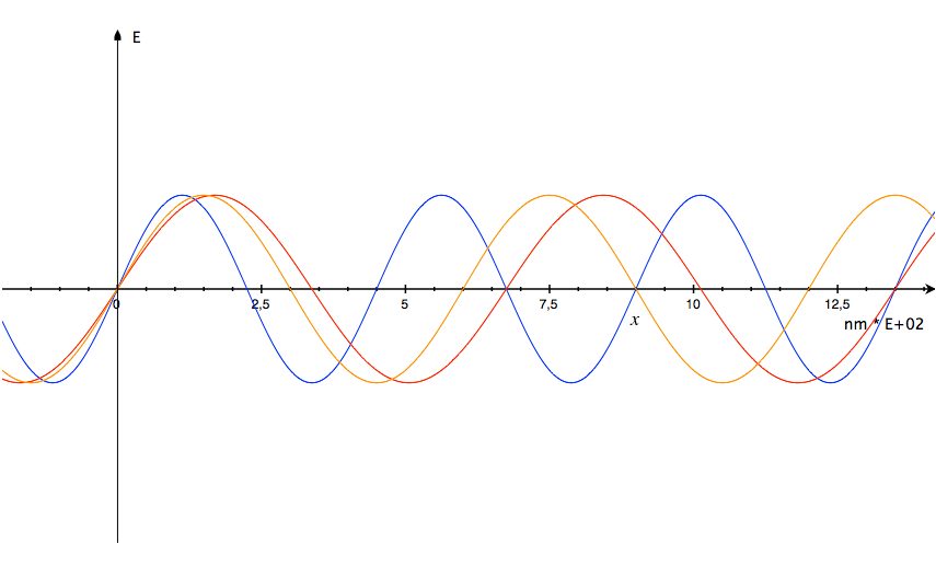
Figure 3: Graph of electric field intensity (E) versus distance from source in fixed time.
Take, for example, a blue color with a wavelength of 450 nm. The color whose wavelength is less than 1.5 times exceeds the scope of visible radiation. The color with a wavelength greater than 1.5 times (675 nm.) is a red color. The color with a wavelength larger by 3/4 times (600 nm.) is an orange color. As a result, we got the following color palette: the main color is blue, the most suitable color is red, a little less suitable for the blue color is orange (fig. 3). The same results can be obtained by operating frequencies instead of the wavelengths.
Also in music there is the concept of tune. The combination of notes can sound not only harmoniously, but also have a shade — a tune (ionian, dorian, phrygian, lydian, ...). Similar feelings can be transferred to the color palette by using the corresponding proportions when constructing it.
Non-spectral colors
Nonspectral colors include colors that are not contained in the spectrum and consist of several spectral colors. Proceeding from the Grassmann additivity law it follows that in the case of selecting a color palette for non-spectral colors the same operations should be performed on its constituent colors preserving the proportions and considering the wavelength boundaries of the visible spectrum.
Let us consider a more recent phenomenon of consonance between two non-spectral colors. The musical sound consists of elementary tones, since along with the oscillation of the sound source itself as a whole, its parts also oscillate. Vibrations of the parts of the vibrating body give rise to weak prisms — overtones absorbed in the basic tone. The scale of simple tones of the corresponding amplitudes forming a complex sound is called the frequency spectrum. All elementary tones that enter into a complex sound are called harmonics. The degree of consonance of the interval is determined by the number of coinciding harmonics of the spectra of both notes: the greater number of coinciding harmonics — the more consonant interval.

Figure 4: Graph of sound pressure versus time in fixed distance from sound source.
Proceeding from this, we believe that the essence of the phenomenon of harmony (consonance) is in the synchronous state of rest (energy is equal to zero) of both waves. On the graphs, this state of rest is displayed in the intersection of two wave functions on the abscissa (time) axis (fig. 4). And the degree of consonance of two wave functions is determined by the number of such intersections per unit of time (or length, under the condition of the same propagation speed): the more — the more consonant. This concept of degree of consonance extends also to non-spectral colors, since they are also wave functions.
Application in computer graphics
A human is able to see colors with wavelengths in the range of 380 — 780 nm. Any four colors are linearly dependent, but there are an infinite number of combinations of three colors that are linearly independent (Grassmann's first law). The independence of colors, according to Grassmann, is that the color feeling caused by one of these three colors can not be obtained by mixing the other two colors in any proportions. It was noticed that it is most convenient to operate with red, green and blue color. Almost all modern monitors work on this principle.
In 1931 the International Lighting Congress (CIE) adopted a characteristic of the color properties of the average (standard) observer, based on the results obtained in 1926 — 1930 by Wright and Guild. The basis of this colorimetric standard is the following colors: 700 nm. (red), 546.1 nm (green) and 435.8 nm. (blue) (RGB system). The received characteristic contains the relationship between the resulting wavelength of the mixture and the amount of red, green, and blue colors in a given mixture.
Later, for comfort calculations, the International Lighting Congress introduced the abstract system CIE XYZ, based on unreal colors. This coordinate system is very comfort for the transition from one system to another. Also, the wavelengths of visible light and the corresponding coordinates of the CIE XYZ mixture were calculated, based on the results obtained for the RGB system.
To reproduce the same color feelings on different output devices (monitor or printer), each such device has its own color profile, which contains its relationship with the abstract CIE XYZ system. In other words, the color profile is used for the possibility of switching between different color systems (sRGB, AdobeRGB, ...). The most common color space is the sRGB system.
On the site the construction of the following consonant intervals is done:
- quint (3/2) symbolized 3/2^ and 3/2v
- quart (4/3) symbolized 4/3^ and 4/3v
- small third (6/5) symbolized 6/5^ and 6/5v
Three systems are used for construction — sRGB (white point D65), CIE XYZ and xyY, as well as tables containing wavelengths of visible light — CIE 1931 2-deg (XYZ CMFs).
For spectral colors (on the main page of the site) we build consonant intervals that do not go beyond the visible spectrum. A proportional increase or decrease of the relative brightness of the color using the xyY system is also performed.
For sRGB colors (on the sRGB page) we construct consonant intervals that do not go beyond the visible spectrum for each (red, green, and blue) color separately. If the interval goes beyond the visible spectrum, we leave the color as is. Further, all three colors obtained are summed separately by each RGB component (red, green and blue) according to relative brightness using the xyY system.
The site
The site presents two different implementations of the wave method — spectral (on the main page) and sRGB (on the RGB page).
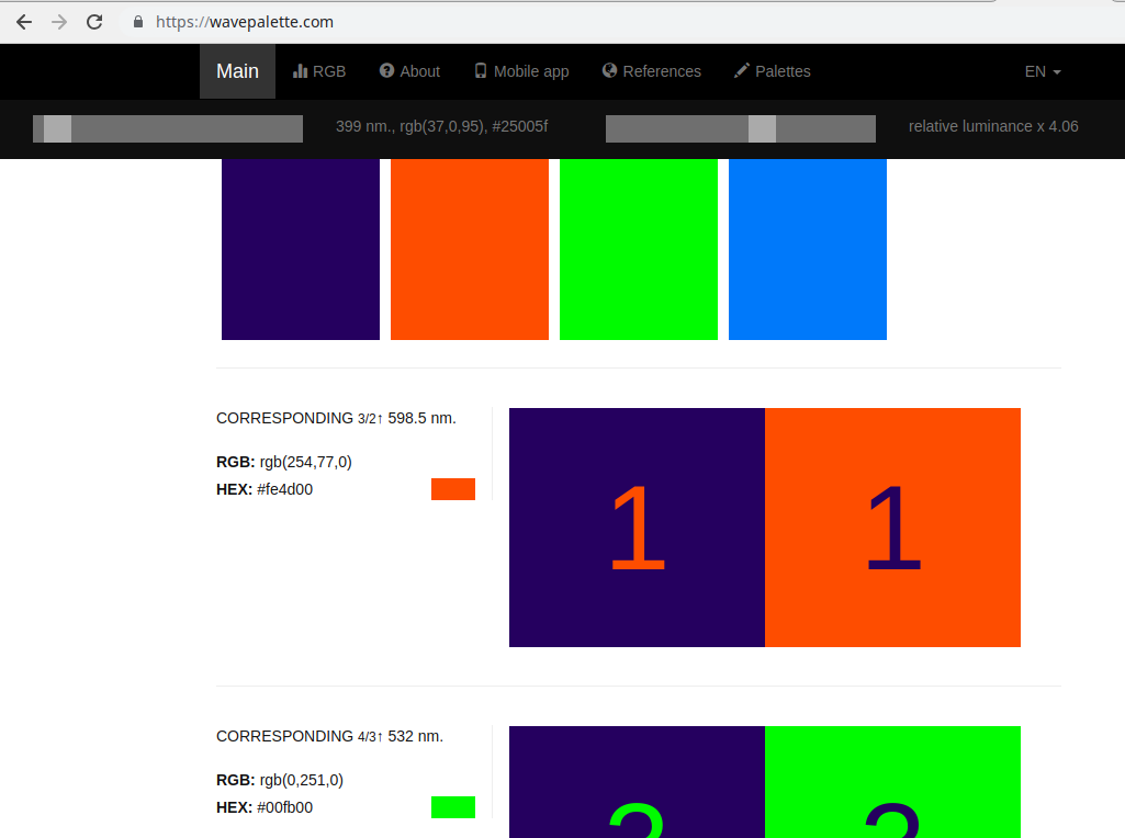
Spectral implementation reflects the essence of the wave method. Here you can choose the most harmonious palette for spectral colors. The colors coming first are the most suitable. Next to each color are its wavelength, rgb and hex codes.
sRGB implementation allows you to build a palette for all SRGB colors (more than 16 million colors), and not just spectral ones. But, since the wave method is applied in this case to each of the three colors (red, green, blue) individually, not all colors are harmonious and you will have to make a choice manually. This method allows you to get more interesting combinations of colors, but requires a self-dependent choice. Next to each color are its rgb and hex codes.
The Refresh button builds a color scheme for a random color.
Share button opens a link to the resulting palette, which you can share with friends.
The RGB button in the spectral implementation switches to the sRGB implementation with the same base color. The color palette in the sRGB implementation will differ from the spectral one due to the application of the wave method to each of the colors separately.
The Mobile Application in the paid and free versions differs only in the presence of advertising.
Conclusions
Above we described and justified from a physical point of view the wave method of constructing the color palette, developed by us. Was described our understanding of the essence of the phenomenon of harmony. This method can be widely used in various design industries.

