The 7.0 release marked a new milestone in the history of the PVS-Studio analyzer — the analysis is now available not only for the code, written in C, C++, C#, but also in Java. In addition to this global improvement, some existing mechanisms for the analysis are refined and improved, diagnostic rules are added. There was another significant change that you could hardly missed. We changed the icon.
Note. In the article, you will not find cunning tricks or tips on designing icons. The purpose of the article is a bit different this time — it is to tell a story, and, if possible, make it interesting.
Why did we decide to do it? Everything is quite prosaic. The current icon was already old and has not been changed for many years. Why not dolly it up along with the impactful version update? So it was settled that we needed to come up with something for the next release 7.0.
You probably have a question — how did you end up with what you have now, having those 3D green letters? To get a better understanding, you should follow the history of changes, which will be described below.
By the way, readers who follow our publications, as well as those who communicate with us at conferences, already may have noticed some changes in the related attributes, for example, in our unicorns. Now they are more often portrayed upright, mostly wear blue shirts, and the number of them had increased.
Now let's get back to the question — why did we ever need to experiment with geometric shapes, if in the articles and at conferences it's our unicorn who is the boss of the show? Why not use him as an icon?
Yes, the unicorn now really strongly associates with PVS-Studio, so before undertaking experiments with the new icon, we had checked, how he would look like an icon.
You can see some examples below.
Installer window:

A part of a context menu, called from Solution Explorer:

Looks not pretty, right? And the smaller was the icon, the worse things were. In a Process Hacker, for example, the unicorn looked absolutely indecent. By the way, we have nicknamed this icon a «banana» because in 16x16 size it's impossible to distinguish him from a banana.
So we decided not to experiment with drawing new unicorns specifically for icons and try changing the existing one ('PVS' green letters). Actually, we have already experimented with a unicorn as an icon, a few years ago. Then we asked a professional to do that. The result of the work was simply thrown out.
Initially it was decided to make the icon more minimalist (remove three-dimensionality) and change the colors. We decided to use a blue color as basic: some elements on the site are painted in this color; unicorns wear a blue T-shirt, whom we can see on the site, in articles, handouts and at conferences booths.
We drew 3 icons to choose.

The second layout was eliminated from the voting immediately and votes divided between the first and the last one. After a short dispute we refused from the first icon — it was too simple.
Even though the third icon was standing out comparing to two other ones, it still didn't meet all our desires. There were experiments with changing the spacing between the letters, the shape of the triangle (from isosceles to equilateral) and so on. One of the key points was, perhaps, a waiver of just one color and palette extension — choosing a color for each letter. The first version of such icon looked as follows.

Color palette extension made variety, but the icon still looked too boring and simple. It seemed to us that the main reason of that was strict horizontal/vertical lines representing boundaries between letters. We decided to experiment with them. Several intermediate options are given below.

A key decision, which strongly influenced the further work, as well as also reflected the final result, became the location of the letter 'V' as follows:

As for the letter 'V', we had no more questions, it suited ideally (even though it looked like a tick). We still had some questions about the boundaries between the letters 'P' and 'S', as it didn't look that graceful, it started from 'nowhere' and went to 'nowhere'. Comparing with 'V', whose lines started and ended in the corners of the shape that looked sad.
After that my colleague (hi, Paull ) suggested such an idea, which determined our further designing process (not word for word quote): «Why do we need this 'add-in' on a triangle? Let's throw it away, then the border line between green and blue will naturally be placed in the same way as 'V'. He just hit the bull's eye!

Nice, minimalistic, borders were set the way we wanted! We continued experiments — it looked great. Satisfied with the result, we even decided to call that prototype as something special -'UltimateTriangle'. When comparing to others, it was immediately clear, which one was the favorite there. Well, you got it, neutral comparing :)
However, when testing more thoroughly, one nuance appeared (of course, we cannot do without them). When looking at the small size of it, it became noticeable that the border between green and blue mingled, we wanted to highlight it somehow.
Colleagues had another claim. The letters 'P' and 'V' could be recognized, 'S' was no longer legible. Maybe it could be 'completed', but you needed to have really cool imagination to do that.
Therefore, we moved on from a triangle. Designing prototypes to solve the problem indicated above, Ekaterina (Kate_Milovidova) (yes, hi for you too:) ) slightly changed the geometry of the shape, by adding another corner and turning it from a triangle into… a stretched and clipped triangle? No matter how it sounds, it looked so renewed!
The sketch of the new shape:

This is how it looked like in a digital format:

Changing of geometry clearly benefited, but lacked separate elements / letters highlighting. To separate the letter 'S', we decided to try using a dark line. The result is presented below.

As you can see, the line exacerbated the matter. Now the main element that stood out from the rest and which focused attention on itself, was the dark 'arrow'.
Nevertheless, separation of the shapes for three clearly divided components solved the problem. Almost the final version looked as follows:

I was pleased with the result. So were the colleagues. Now they could see the letters 'PVS' more clearly (how on earth are you doing it?!).
Reaction of Evgeniy (EvgeniyRyzhkov), our CEO (hi to you as well :) ), at first was the following: „Cool, but where is 'PVS' here?“ Amazing, but after a while, he also started seeing letters…
Further refinements related to a small adjustment of colors and reconciling the spacing between the elements — it should not have looked too big when the image was displayed on a large scale, but the line should not have looked as a barely visible stripe on small images, for example, of 16x16 size.
In the end, we chose the following variant, which became final.

If you've been using PVS-Studio 7.0, probably you have already seen this icon, but just in case, here are a few examples of how it looks in different places.
Installer window:

A part of a context menu, called from Solution Explorer:

Look of the analysis progress window when switching open windows:

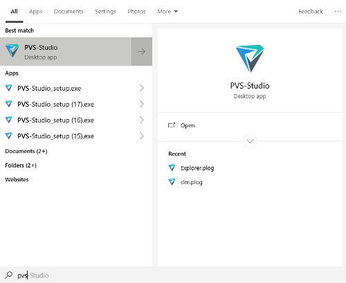
The example of how the new icon is displayed when searching:

I'd like to present a short way from the old to the new icon below:

Well, it worked out well, how do you think? By the way, can't help but wonder, do you see 'PVS' in the new icon?
Conclusion
I hope I managed to tell you an interesting story, by showing you our path and having explained how we came from the old image to the new one. I would recommend taking a close look at it when analyzing your projects not just when reading the article. At the same time you can check out a new download page and request a trial key there if necessary.
For those who is interested in such stories, I also recommend reading this article (in case if you missed it) „PVS-Studio project — 10 years of failures and successes“. However, a great deal has changed since then (at least, we moved into the new office), so we definitely have something to tell…

