In June, we heard about SwiftUI for the first time — a totally new way of creating and working with UI elements in iOS and macOS (also iPadOS) apps. It felt like Christmas in the summer. It's new, it's declarative, it's sexy! And now, just a few weeks after iOS 13 has been released, we can start to use SwiftUI in all our projects. Let's learn how to use this amazing tool that Apple gave us, to create the classic Tinder-esque Swipe Cards.
In this article, I would like to show you how to achieve a Tinder-like card view and behavior (swipe to action), with just a few lines of code.
To achieve this, we need to do the following things, in order:
So let's get started.
UserView is built from two subviews, one is NameView which contains the user name, age, and hobbies, and the second view is just an avatar view that displays the user's profile picture.
First, we need to define the NameView, this will represent the user name, age, and hobby. NameView is conforming to the View protocol, which is used to define custom views in SwiftUI. The view protocol has only one requirement and that's defining the body property which should return the view structure and describes its behavior. You can check more about the View protocol in the official Apple documentation.
Let's break down the objects that we use to define this View:
Please notice that we are not using a return statement here, inside the body property, but instead we are returning a VStack. SwiftUI is using the omit-return proposal implemented in Swift 5.0. You can check more about this here.
This is how AvatarView is defined:
Let's dive into the components that are making this avatar unit:
And now let's embed these two views into a single container view, named UserView.
Here's what's going on:
After all these steps, run the app. You will get the following screen:

Let’s add a small helper method now. Before I show you how NavigationView is defined, let's create a helper method, which looks like this:
Here, we have defined a button factory method, that creates a new button from a given image and a rendering mode. There is no action handler, since that falls out of scope for this article.
SwiftUI will automatically make the Spacers of equal width, and it will give us the following navigation view:

In the above code snippet, we've defined the first button from our bar view. Here's what's going on:
Now let's implement the rest of the buttons:
And as a result we now have this beautiful view:

This section is for more advanced SwiftUI. This is really where things get interesting. We would like to implement the swipe gesture on the action view. This behavior is a nice use case for a PageViewController, but this view controller will be history soon, so this is where we can show the real power of SwiftUI.
So let's see how SwipeView is implemented:
Here we have used a few new interesting SwiftUI concepts:
We are enumerating over the existing users by creating a UserView for each element:
DragGesture is a little complicated, but nevertheless, it adds all the pagination logic in just a few lines of code. Let's break down DragGesture:
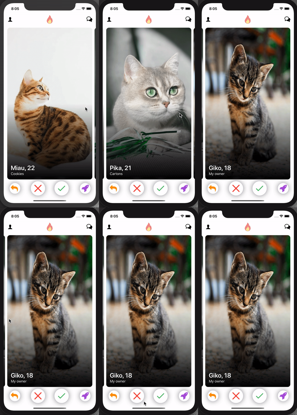
Our content view is extremely simple at this point — it composes all created the views we previously created, inside a vertical stack (VStack). For the NavigationView and SwipeView we have added some default padding on the bottom, and the whole VStack has paddings added to all edges.
That's it. Done. This is how our app looks like now:

As we can see SwiftUI is very powerful tool, it gives us an easy way to define and manipulate UI in a short declarative code. React Native developers would recognize this declarative paradigm right away.
But remember: SwiftUI is still under development and can be extremely unstable for now. If you would like to check all code base for this project you can find it on Github.
If you have any thoughts or questions about SwiftUI, feel free to share them in comments. Also, if you've enjoyed this article, please share it with your community to help us spread the word!
In this article, I would like to show you how to achieve a Tinder-like card view and behavior (swipe to action), with just a few lines of code.
To achieve this, we need to do the following things, in order:
- Create UserView
- Create NavigationView
- Create BottomBarView
- Create SwipeView
- Put all this together inside ContentView
So let's get started.

UserView
UserView is built from two subviews, one is NameView which contains the user name, age, and hobbies, and the second view is just an avatar view that displays the user's profile picture.
struct NameView: View {
    let name: String
    let age: Int
    let hobby: String

    var body: some View {
        VStack(alignment: .leading) {
            Spacer()
            Text("\(name), \(age)")
                .font(.title)
                .fontWeight(.semibold)
                .foregroundColor(.white)
            Text(hobby)
                .font(.system(size: 16))
                .fontWeight(.regular)
                .foregroundColor(.white)
        }
        .padding()
    }
}
First, we need to define the NameView, this will represent the user name, age, and hobby. NameView is conforming to the View protocol, which is used to define custom views in SwiftUI. The view protocol has only one requirement and that's defining the body property which should return the view structure and describes its behavior. You can check more about the View protocol in the official Apple documentation.
Let's break down the objects that we use to define this View:
- VStack which acts like a container for all the objects aligning them vertically
- Spacer that tells SwiftUI that this view should be aligned on the bottom
- Text which represents the label with name & age, with the following properties:
- Second Text object that has similar properties and displays the user's hobby
Please notice that we are not using a return statement here, inside the body property, but instead we are returning a VStack. SwiftUI is using the omit-return proposal implemented in Swift 5.0. You can check more about this here.
AvatarView
This is how AvatarView is defined:
struct AvatarView: View {
    let image: UIImage

    var body: some View {
        Image(uiImage: image)
            .resizable()
            .overlay(
                Rectangle()
                    .fill(LinearGradient(gradient: Gradient(colors: [.clear, .black]),
                                         startPoint: .center, endPoint: .bottom))
                    .clipped()
        )
            .cornerRadius(12.0)
    }
}
Let's dive into the components that are making this avatar unit:
- Image — which displays the user's picture
- resizable — this method specifies that the image should resize to fit into the place where it's embedded
- overlay(Rectangle) — here we are defining gradient that will be a nice background for NameView, this gradient starts at image center and finishes at the bottom, it has clear color at the start and black at the bottom
- cornerRadius — the picture will have a cornered radius
And now let's embed these two views into a single container view, named UserView.
UserView
struct UserView: View {
    let userModel: UserModel

    var body: some View {
        ZStack(alignment: .leading) {
            AvatarView(image: userModel.image)
            NameView(name: userModel.name, age: userModel.age, hobby: userModel.hobby)
        }
        .shadow(radius: 12.0)
        .cornerRadius(12.0)
    }
}
Here's what's going on:
- ZStack — This is a stack view that will align its children's on the same axis. You can read more about ZStack here
- AvatarView — Our avatar view containing the image provided via UserModel
- NameView — Our name view displaying the name based on the user model
After all these steps, run the app. You will get the following screen:

Let’s add a small helper method now. Before I show you how NavigationView is defined, let's create a helper method, which looks like this:
struct ViewFactory {
    static func button(_ name: String, renderingMode: Image.TemplateRenderingMode = .original) -> some View {
        Button(action: {}) {
            Image(name)
                .renderingMode(renderingMode)
        }
    }
}
Here, we have defined a button factory method, that creates a new button from a given image and a rendering mode. There is no action handler, since that falls out of scope for this article.
NavigationView
struct NavigationView: View {
    var body: some View {
        HStack {
            ViewFactory.button("profile_icon")
            Spacer()
            ViewFactory.button("fire_icon")
                .scaleEffect(2)
            Spacer()
            ViewFactory.button("chat_icon")
        }
    }
}
SwiftUI will automatically make the Spacers of equal width, and it will give us the following navigation view:

BottomBarView
struct BottomBarView: View {
    var body: some View {
        HStack {
            ViewFactory.button("back_icon", renderingMode: .template)
                .foregroundColor(.orange)
                .background(
                    GeometryReader { geometry in
                        Circle()
                            .offset(x: 2.5)
                            .foregroundColor(.white)
                            .shadow(color: .gray, radius: 12)
                            .frame(width: geometry.size.width * 1.5, height: geometry.size.height * 1.5)
                    }
            )
            Spacer()
            ...
}
In the above code snippet, we've defined the first button from our bar view. Here's what's going on:
- ViewFactory.button — here we are using our helper method to define button with image with renderingMode .template which allows you to put a custom color for this image
-
.foregroundColor — defining the color of our view
-
.background — this method defines the given object's background view
- GeometryReader — a container view that defines its content as a function of its own size and coordinate space. We are using this to get the current size of a button and define the background circle with the given frame. Learn more about Geometry Readers here.
- Circle — defines the background shape
- .offset — circle x-axis offset
- .foregroundColor — circle tint color
- .shadow — circle shadow
-
.frame — defines the circle frame using the geometry reader's size (here we are defining a background circle, 1.5x bigger than the current button)
Now let's implement the rest of the buttons:
struct BottomBarView: View {
    var body: some View {
        HStack {
            ViewFactory.button("back_icon", renderingMode: .template)
                .foregroundColor(.orange)
                .background(
                    GeometryReader { geometry in
                        Circle()
                            .offset(x: 2.5)
                            .foregroundColor(.white)
                            .shadow(color: .gray, radius: 12)
                            .frame(width: geometry.size.width * 1.5, height: geometry.size.height * 1.5)
                    }
            )
            Spacer()
            ViewFactory.button("close_icon", renderingMode: .template)
                .foregroundColor(.red)
                .background(
                    GeometryReader { geometry in
                        Circle().foregroundColor(.white)
                            .frame(width: geometry.size.width * 2, height: geometry.size.height * 2)
                            .shadow(color: .gray, radius: 12)
                    }
            )
            Spacer()
            ViewFactory.button("approve_icon", renderingMode: .template)
                .foregroundColor(.green)
                .background(
                    GeometryReader { geometry in
                        Circle()
                            .foregroundColor(.white)
                            .shadow(color: .gray, radius: 12)
                            .frame(width: geometry.size.width * 2, height: geometry.size.height * 2)
                    }
            )
            Spacer()
            ViewFactory.button("boost_icon", renderingMode: .template)
                .foregroundColor(.purple)
                .background(
                    GeometryReader { geometry in
                        Circle()
                            .foregroundColor(.white)
                            .shadow(color: .gray, radius: 12)
                            .frame(width: geometry.size.width * 1.5, height: geometry.size.height * 1.5)
                    }
            )
        }
        .padding([.leading, .trailing])
    }
}
And as a result we now have this beautiful view:

SwipeView
This section is for more advanced SwiftUI. This is really where things get interesting. We would like to implement the swipe gesture on the action view. This behavior is a nice use case for a PageViewController, but this view controller will be history soon, so this is where we can show the real power of SwiftUI.
So let's see how SwipeView is implemented:
struct SwipeView: View {
    @State private var offset: CGFloat = 0
    @State private var index = 0

    let users = [...]
    let spacing: CGFloat = 10

    var body: some View {
        GeometryReader { geometry in
            return ScrollView(.horizontal, showsIndicators: true) {
                HStack(spacing: self.spacing) {
                    ForEach(self.users) { user in
                        UserView(userModel: user)
                            .frame(width: geometry.size.width)
                    }
                }
            }
            .content.offset(x: self.offset)
            .frame(width: geometry.size.width, alignment: .leading)
            .gesture(
                DragGesture()
                    .onChanged({ value in
                        self.offset = value.translation.width - geometry.size.width * CGFloat(self.index)
                    })
                    .onEnded({ value in
                        if -value.predictedEndTranslation.width > geometry.size.width / 2, self.index < self.users.count - 1 {
                            self.index += 1
                        }
                        if value.predictedEndTranslation.width > geometry.size.width / 2, self.index > 0 {
                            self.index -= 1
                        }
                        withAnimation { self.offset = -(geometry.size.width + self.spacing) * CGFloat(self.index) }
                    })
            )
        }
    }
}
Here we have used a few new interesting SwiftUI concepts:
- @ State — A persistent value of a given type, through which a view reads and monitors the value, which means that whenever this property will change, the view will be reloaded to adjust to the given state update. You can check more about State here.
- DragGesture — this object will be used to recognize every swipe that user makes on screen. You can read more about this here: developer.apple.com/documentation/swiftui/draggesture
- @ State private var offset: CGFloat = 0 — this property will be used to define the current scroll view offset when users swipe over the screen
- @ State private var index = 0 — this property defines which user view is currently on the screen
- ScrollView — horizontal scroll view without indicators, that will be a container for our user view
- HStack — horizontal stack view which contains all user views
- content.offset(self.offset) — it is creating a connection between the offset state and the scroll view content offset. This means that whenever the offset property will change, the scroll view offset will also be updated
We are enumerating over the existing users by creating a UserView for each element:
-
.frame — here we are defining the scroll view frame that should fit the screen's width, and should be aligned properly to its container
-
.gesture — here we are adding our DragGesture object
DragGesture is a little complicated, but nevertheless, it adds all the pagination logic in just a few lines of code. Let's break down DragGesture:
-
onChanged() — this block is invoke whenever user starts and is in time of dragning gesture, here we are calculating current user view offset that follows users finger
-
onEnded() — here we are informed when drag gesture ends, here we need to calculate if user would like to swipe this view (left or right), or maybe this gesture was marked, and user would like to stay on this screen
-
withAnimation — this closure is invoked with animation, and allows to change offset smothly
ContentView
struct ContentView: View {
    var body: some View {
        VStack {
            NavigationView()
                .padding(.bottom)
            SwipeView()
                .padding(.bottom)
            BottomBarView()
        }
        .padding()
    }
}
Our content view is extremely simple at this point — it composes all created the views we previously created, inside a vertical stack (VStack). For the NavigationView and SwipeView we have added some default padding on the bottom, and the whole VStack has paddings added to all edges.
That's it. Done. This is how our app looks like now:

Final thoughts
As we can see SwiftUI is very powerful tool, it gives us an easy way to define and manipulate UI in a short declarative code. React Native developers would recognize this declarative paradigm right away.
But remember: SwiftUI is still under development and can be extremely unstable for now. If you would like to check all code base for this project you can find it on Github.
If you have any thoughts or questions about SwiftUI, feel free to share them in comments. Also, if you've enjoyed this article, please share it with your community to help us spread the word!

